Skip to content
01344 578 104
info@insightgroup.co.uk
0 Items
-
Client Login
LinkedIn
Twitter
About
Services
Website Design and Build
SEO – Search Engine Optimisation
Social Media Management
Lead Generation
WordPress Support & Maintenance
EEK!
Packages
Website Packages
SEO Packages
Social Media Packages
Lead Gen Packages
WordPress Support Packages
Clients
Tech.
Contact
Search
Search
Submit
Blog & News
View Post
Why WordPress website support agencies are just like the office maintenance team!
View Post
Why do people insist on DIY marketing?
View Post
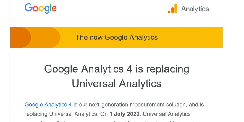
Google Analytics 4 (GA4) – why you need to switch today
View Post
New Google Ranking – Page Experience is a Web Vital
View Post
How to use keywords to target your audience
View Post
How to improve your email marketing campaigns
View Post
5 Easily actionable SEO tweaks and tips
View Post
Top tips for improving your web design
View Post
3 reasons email marketing is smart for your small business
View Post
4 ways to make email marketing work for your business
Load More
About
Contact
Services
Website Design and Build
SEO – Search Engine Optimisation
Social Media Management
Lead Generation
WordPress Website Maintenance
EEK!
Packages
Website Packages
SEO Packages
Social Media Packages
Lead Gen Packages
WordPress Support Packages
Clients
Tech.
Blog & News
Back To Top
Search
Submit
0
0
Your Basket
Your basket is empty
Return to Store
We use cookies to ensure that we give you the best experience on our website. If you continue to use this site we will assume that you are happy with it.
Ok
Privacy policy